The Psychology Behind Colors in Logo Design
Welcome to BU Neek Internet Marketing, your go-to resource for insightful information on the art and science of logo design. In this comprehensive guide, we delve into the fascinating world of color psychology in logo design, exploring how different hues impact consumer perception, brand messaging, and overall design strategy.
Understanding the Role of Color Psychology in Logo Design
Color psychology plays a pivotal role in logo design, influencing how audiences perceive a brand and interact with its visual identity. When selecting colors for a logo, designers must consider the emotional responses and associations that different hues evoke.
The Impact of Color on Consumer Perception
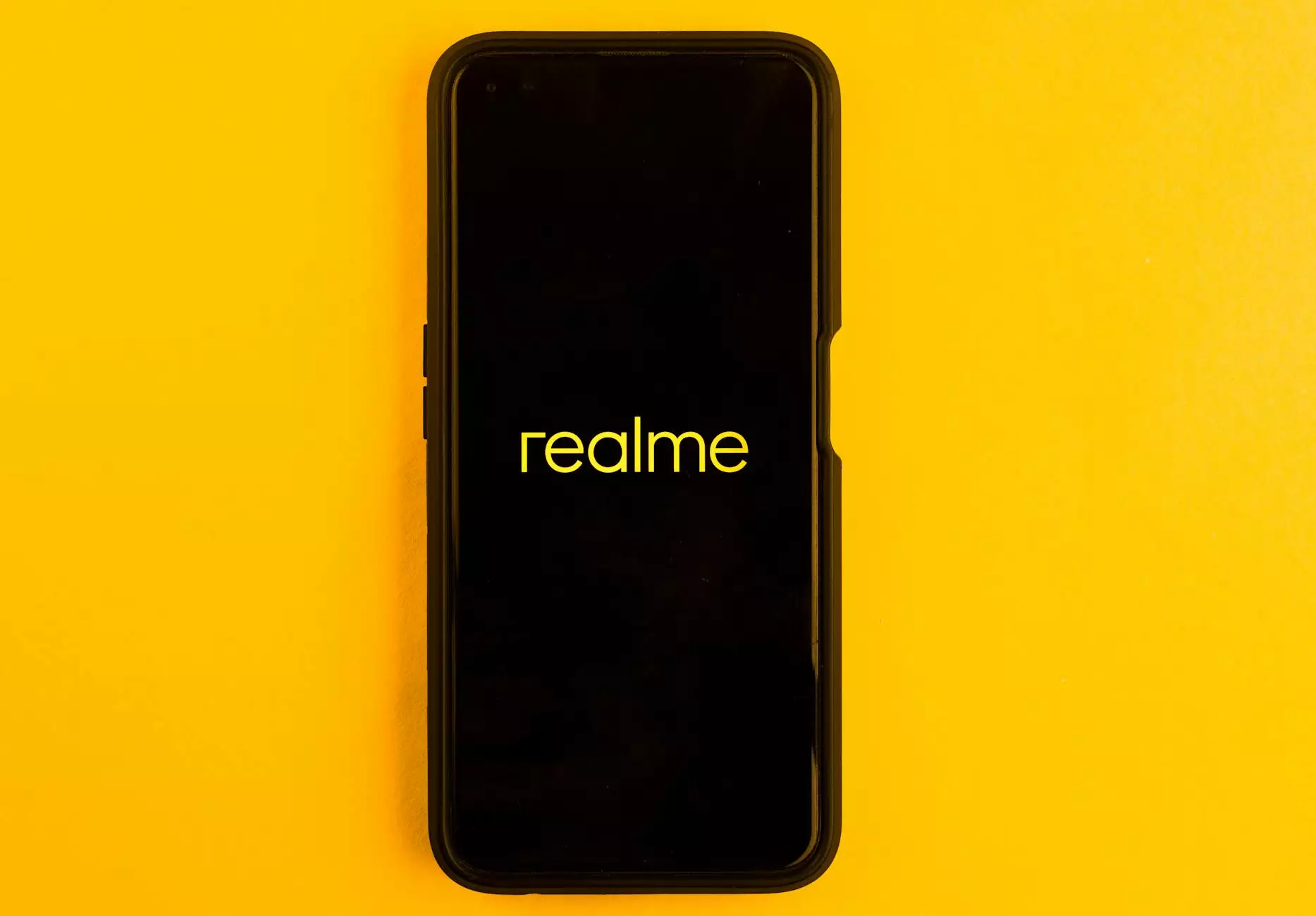
The colors used in a logo can convey subtle messages and trigger specific emotions in viewers. For example, red is often associated with energy, passion, and excitement, while blue conveys trust, calmness, and professionalism. By strategically incorporating these color meanings into a logo design, businesses can effectively communicate their brand values and connect with their target audience.
Choosing the Right Colors for Your Logo
When selecting colors for a logo, it's essential to consider the nature of the business, target market, and desired brand image. For instance, a technology company may opt for grey and blue to symbolize innovation and reliability, while a health and wellness brand could use green and white to convey a sense of freshness and purity.
The Psychological Significance of Individual Colors
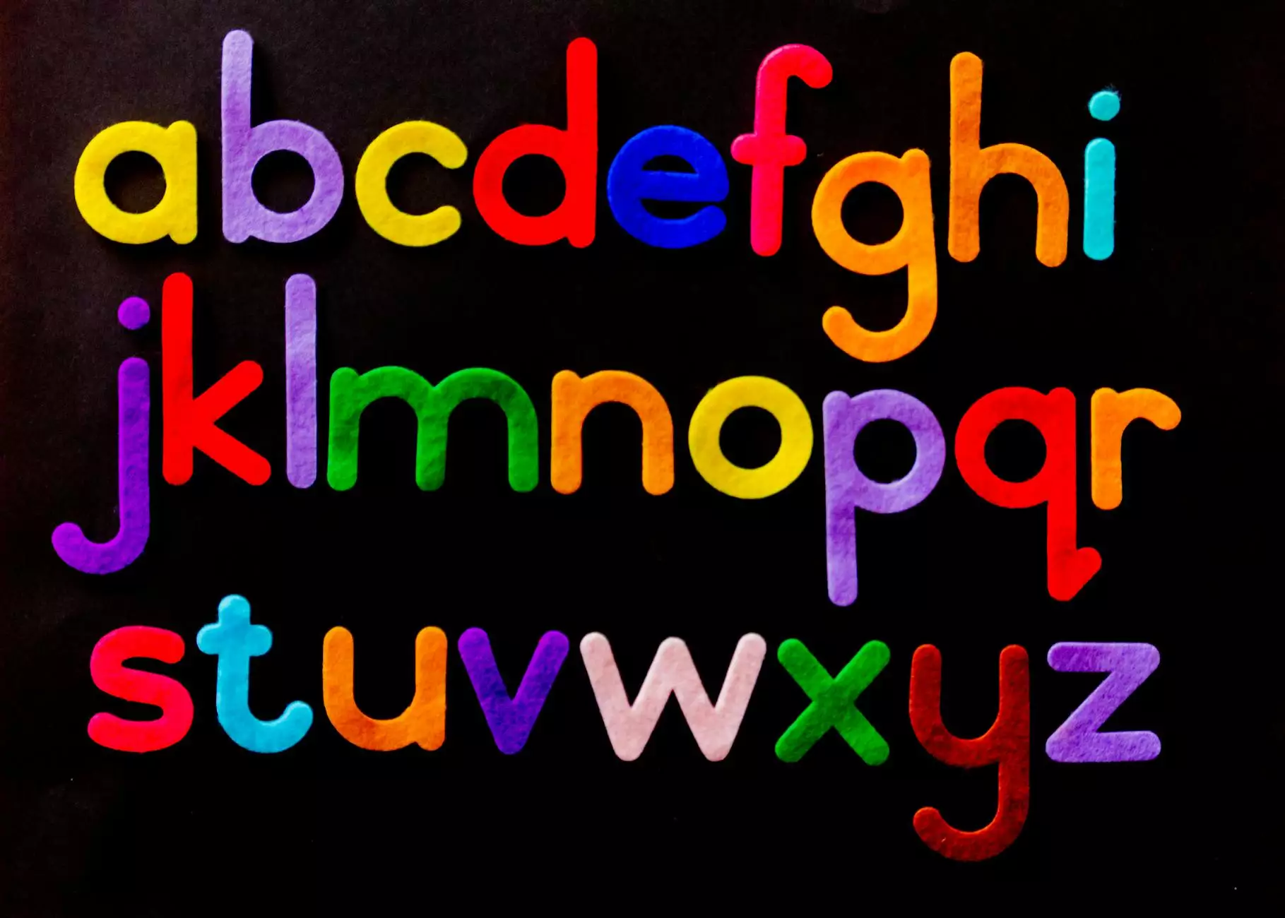
Each color carries its own set of psychological connotations, making it imperative for designers to understand the nuances of color symbolism in logo creation:
Red
Red is often associated with energy, passion, and excitement. It can create a sense of urgency and stimulate appetite, making it a popular choice for food and beverage brands.
Blue
Blue conveys trust, reliability, and professionalism. It is a favorite among corporate brands seeking to establish credibility and build consumer confidence.
Yellow
Yellow is associated with optimism, warmth, and creativity. It can evoke feelings of happiness and friendliness, making it ideal for brands targeting a youthful audience.
Green
Green symbolizes growth, harmony, and vitality. Brands in the eco-friendly and wellness sectors often use green to signify sustainability and well-being.
By leveraging the power of color psychology in logo design, businesses can create impactful visual identities that resonate with their audience and convey their unique brand values.
Conclusion
In conclusion, color psychology in logo design is a powerful tool that can influence consumer perception, brand identity, and market positioning. By understanding the psychological associations of different colors, designers can craft logos that captivate audiences, communicate brand messages, and foster lasting connections with consumers.
For expert guidance on leveraging color psychology in logo design for your business, contact BU Neek Internet Marketing. Let us help you create a compelling visual identity that sets your brand apart and resonates with your target audience.